JP End-of-Year Edition: Evidence, policy, and political will
(Jakarta Post, 29 December 2006) The poverty rate increased last year. It will increase again next year without the political will to do what it takes to prevent it.
From February 2005 to March 2006, the poverty rate increased from 16.0 to 17.8 percent. There are now 39.1 million poor people, four million (or 11 percent) more than the previous year. This was the first increase after the crisis. The question is, why and how to prevent it from happening again?
To answer the “why”, we need to examine the evidence, the data. The “how” – the policy – follows from the evidence (hence the term “evidence-based policy”). The next step is the political process. Alas, it is the hardest: Despite politicians’ claims, there isn’t really a strong interest group to promote the interests of the poor. The poor stand to lose out from the political process.
The current administration needs to be more decisive in playing this role, especially since it promised to cut poverty rate by more than half to 8.2 percent by 2009. The government cannot focus just on medium- and long-term programs – it also needs to address short-term concerns of the poor. After all, two years to 2009 don’t exactly count as medium or long-term.
But we are getting ahead of ourselves. Let’s start with the first question: Why did poverty increase last year?
We are what we consume Figure 1 provides our first clue. By plotting the poverty rate against the poverty line we can see how sensitive the poverty rate is to increases in the poverty line. The poverty line is defined as the per-capita expenditure needed to purchase the set of goods considered to be the minimum needed to subsist. In 2006 BPS, the central statistics agency, set it at Rp.152,847 per person per month, which gives us a poverty rate of 17.8 percent (left axis) or equal to 39.1 million people (right axis).
What this figure shows is that Indonesia’s poverty rate is sensitive to poverty-line movements. A slight increase goes a long way: a 10-percent increase from the current poverty line will result in a 30% increase in the number of poor to 50.8 million people (i.e., a 23.1% poverty rate).
Fact #1: Indonesia’s poor is very vulnerable to poverty line changes.
Meanwhile, poverty lines are mainly driven by price inflations – more specifically, the price inflations of goods consumed by poor (and near-poor) households. Notice the phrase in italic. Hence, the poverty line will not increase if, for instance, an accident in the sky pushed airlines’ insurance premium up, spiking the prices of airfares (because the poor rarely, if ever, fly) – unless, of course, these flights happen to transport goods that make up a large share of poor households’ consumption.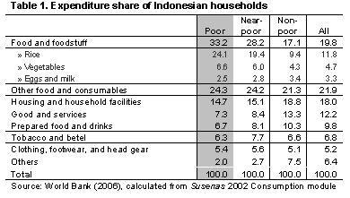
So, what are these goods? Table 1 shows the expenditure of Indonesian households. Food expenditure makes up for more than half of poor (and near-poor) households’ consumption. Within it, rice takes up almost a quarter of total expenditure, making it the most important single-item commodity for the poor.
Thus, we arrive at Fact #2: The poverty line is more responsive to the price inflations of food, particularly rice, than those of non-food commodities.
Going back to the original question: Why did the poverty rate increase last year? The highly-visible fuel-subsidy cut policy was often blamed for this. However, as suggested World Bank’s (2006) recent poverty report, this is a blame misdirected: the subsidy-cut triggered a targeted cash transfer program, whose value for individual households is equivalent to 14 percent of their expenditure. Overall, the program adequately compensated the direct effect of the subsidy cuts to the poor.
Instead, it argues that the 33 percent increase in rice prices – almost double that of the general price inflation – between February 2005 and March 2006 was the main cause of the increase in the poverty rate. I find this convincing. Based on Fact #2, rice prices is the likely culprit driving the increase in the poverty line, which itself is the likely cause of the poverty rate increase.
Getting to the “how”
Managing a stable, and preferably low, inflation on goods consumed by poor households is therefore important to reduce poverty. But careful readers would notice from Figure 1 that it’s not the only means to reduce poverty. Figure 2 shows two other means to the same end: first, shift the whole curve to the right; and second, reshape of the curve so that its left tail is thinner. Or, in words, the two means are economic growth and redistribution.
And yet, the debate focuses only on the poverty line – which is, essentially, what the rice price debate is all about. Why?
In explaining last year’s poverty rate increase, here is why: Last year’s growth at 5.6 percent was rather good by previous years’ standard, and the targeted cash transfers after the October fuel-subsidy cut was the kind of redistribution to make the left tail thinner. So, on those two fronts, the policies were already in the right direction. But not on keeping the poverty line low.
In this sense, one can say that the rice price-inflation “masterminded” last year’s increase in the poverty rate. Unfortunately, this fact is buried under the surrounding political controversy with critics seemingly more interested in shooting the messenger instead of scrutinizing the message. Consequently, the poor continue to pay the price as rice prices continue to rise.
At this point, figuring out the “how” isn’t the most difficult problem. There are many suggestions – from improving the rice market structure to opening rice imports with some tariffs, both to allow more stable rice prices. The problem now is that of political will: Are politicians willing to take the necessary steps of communicating the evidence behind these policies and, when push comes to shove, going ahead with them for the sake of the poor?
Looking ahead
Will the poverty rate increase next year? Let’s briefly examine the three channels through which policy can immediately affect the poverty rate.
On growth, it is expected to remain moderate (by East Asian standard) at around 5.8-6.3 percent. This will shift the curve to the right. Meanwhile, the government’s new anti-poverty program, “The National Program for Community Empowerment,” will try to further shift the curve. Alas, this is likely to happen only in medium- to long-term.
Meanwhile, if the government goes ahead with its plan to end the targeted cash transfer scheme without a comparable replacement then, predictably, a lot of people will drop to the left side of the curve. Whether growth can compensate this drop remains an open question. Finally, so far the government has not been able to control the rice price-inflation. If this continues, the poverty line will rise accordingly.
Policy can actually prevent this increase in poverty. The evidence is there, and so are the policy prescriptions. What remains to be seen is whether the will is there. Because if it is not then, once more, we shall see the poor paying the price of the politicians’ indifference – just like last year.
Update: Rasyad Parinduri blogged this article, commenting specifically on Figure 1. In the post's comments, I tried to clarify the meaning of the graph.
posted by Arya Gaduh at
3:55 am
![]()


6 Comments:
If the poor make up around 20% of RI's population, then why do you surmise that it isn't in politician's interests to acquire more of the poor's interests?
Perhaps an enterprising soul could start a party on the left which specifically looks to empower and help the poor. That would be interesting :)
By Unknown, at 12/31/2006 12:52:00 pm
great article. can i interview you specifically on these points for our nationwide-syndicated radio program Perspektif Baru www.perspektifbaru.com ? please email to wimar@perspektif.net if yo can come over to our ministudio at Jalan Fatmawati at your soonest convenience - indicate your preference.
By wimar, at 12/31/2006 05:31:00 pm
John:
Problem is, the poor are only valuable around the time of elections. Even with 20%, political parties thought that they could always buy their votes using short-term means (or break the poor's votes up using organized interests, e.g., farmers, labourers, etc).
Organizing the poor, especially the poor as a consumer, is difficult in the way that micro-finance is difficult: it's really banking on quantity over quality.
By Arya Gaduh, at 12/31/2006 05:44:00 pm
i remember reading an article in the jp recently. basically it said that Suharto's regime never really ended, as pretty much the same types were in power now.
it looked at other countries in the region, and lamented the lack of /well/ organised activist / opposition groups (a la S. Korea).
i only have a shakey grasp of indonesian politics and history, but perhaps the purges of '65 etc. still skew RI politics to the right...
By Unknown, at 1/02/2007 12:36:00 pm
Arya, nice article and supported with a relevant data
Just want to ask simple question on the graph. It is supposed to be the CDF right? Given the graph, I do not see the story that many poor people are around the poverty line . If this is true (which I also belive that this is the case), as the proverty line increase, the poverty rate should increase dramatically. Thus, it means that the graph should be almost vertical on the some spot and thus goes to horizontal somewhere else. Not just the graph a'la pareto distribution.
Why do I point out this issue? I agree with your solution.If the government do not have many constraint, you could do almost all ur suggestion. Hopefully the results would be the same as we are all hoped. However, in Indonesia right now, the government has so many constraint that limit his ability to do lots of policy. Thus, the maximum we can do is pick the best policies that could handle the poverty issue better than the other.
That's why, we need a more representatives graph. Based on the graph, we could pick the best policy that has biggest marginal effect on the poverty rate.
Do you think the shape of the graph matter?
Ado
Anyway, good analysis though. :D
By Anonymous, at 1/03/2007 03:46:00 pm
John,
I am not a political scientist as well. But from my layman understanding of Indonesian politics, I think that's probably true especially for more leftist activities since, although not enforced as vigilantly as before, there is still a ban on "communism".
I don't know about other countries (and how do you define "opposition" in Indonesia anyway given the absence of a clear ideological division?), but I think interest groups are many. I guess, after the 1997-2000 activities, perhaps we are experiencing a "demonstration fatigue" ;-D
Ado,
Yes, it's a CDF of sort (I had wanted to draw a pdf of expenditure , but a friend warned that people wouldn't understand it).
As for the graph, I only showed up to three times poverty line on the x-axis. To see the full CDF, we'll have to go all the way to more than 100 times poverty line. At 10 times poverty line, the poverty rate is 99%, and the last one percent goes a long way.
As for policy, I don't think this type of graph can tell us of proper anti-poverty policies. I don't believe any macro-level graph can. Poverty is a micro-level problem, and proper solutions can only be found locally. The role of the national policy is to create an environment that will allow poor people to bring themselves out of poverty.
The aim of the graphs was instead to illustrate how one can decompose the impacts of macro policies to poverty rates. Sort of like the income and substitution effect for changes in the budget line in micro.
On policy, of course we cannot do all three given, as you pointed out, budget constraints. But that's not what I was suggesting either. The reason for the graphs, in addition to educate, was to show that it was indeed the poverty-line shift (driven by increased rice prices) that drove last year's poverty rate increase.
Does the shape of the graph matter? At the far left, definitely. People in the far left who live below subsistence are robbed of their capabilities to bring themselves out of poverty. Social insurance and consumption subsidy for the poorest matter.
But elsewhere along the graph, not so much.
By Arya Gaduh, at 1/03/2007 05:43:00 pm
Post a Comment
<< Home