Poverty analysis as a partial equilibrium exercise
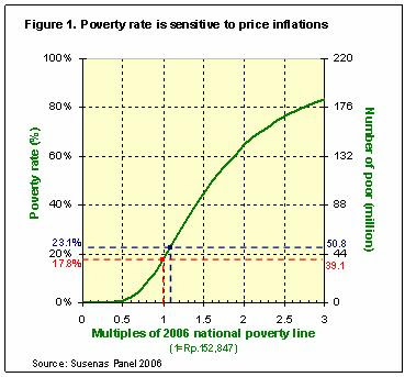
Rasyad Parinduri argues here that Figure 1 of this article (shown below), to quote him, "cannot tell us 'how sensitive the poverty rate is to increases in the poverty line'" because it doesn't plot the poverty rate against the poverty line. I'll try to explain here why he's wrong by drawing an analogy to the supply-demand curve familiar to most undergraduate economics student.
[PS: My apology to those not familiar with the demand and supply curves since this post may be a bit arcane.]
But first, what are demand and supply curves? A demand curve simply traces the number of people willing to pay for a certain good at a certain price. The supply curve, on the other hand, traces the number of people willing to produce a certain good given a certain price paid for it. Both supply and demand curves trace two variables: the number of people and the price observed (for one, the buying price; for another, the selling price). This is Microeconomics 101.
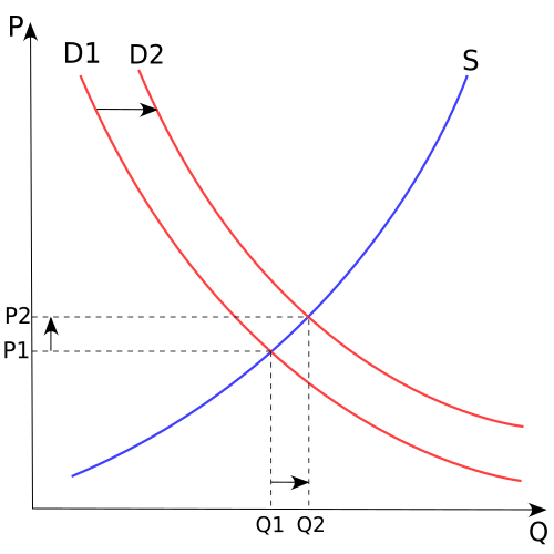
The graph above are supply and demand curves. The point at which the two curves intersect is what we call the equilibrium (price-quantity) point. Given the population's demand and supply curves, this equilibrium point describes the price and quantity at which goods are actually traded in a competitive market. Shifts in the either curve can change this equilibrium point (or the actual price/quantity-exchanged observed in the market).
How is the poverty graph analogous to the supply-demand graph? First, the axes. The poverty graph plots the number of people against the expenditure level. It is actually almost like a supply-demand graph with former variable analogous to quantity; the latter, price; and the axes reversed (that is, instead of having Q(uantity) on the x-axis, the "quantity" in the poverty graph is now on the y-axis -- and vice versa).
Second, the curves. The way I draw it, the green curve (an expenditure cumulative distribution function or cdf) traces the number of people whose income are below the expenditure level shown on the x-axis. At a higher the expenditure level, the number of people below this income increases. I'll call this "the expenditure distribution curve" and it's behaviour is a bit like the supply curve.
Now, the poverty line is a bit tricky -- it's not exactly analogous to the demand curve. The poverty line is that expenditure level where people subsist. For simplicity, most analyses draw the poverty line as a straight vertical line, but in reality, it probably isn't. Depending on one's characteristics (geographical location, choice of food, even biological metabolisms), this level (converted into expenditure levels) may differ for each individual. The actual poverty line is not smooth, but the (fitted) curve is likely to be almost vertical will definitely cut the expenditure distribution curve. In a way, the poverty line is analogous an administered producer price in the supply-demand context.
So, the curves aren't really analogous to the supply-demand curves (since there is no analogy to the demand curve). But what is important is the fact that the actual poverty rate that we observe comes from the intersection of these two curves, just like the actual price/quantity combination we observe comes from the intersection of the supply and demand curves. Each individual curve does not have adequate information to tell us about the actual poverty rate, just like the supply curve (or the demand curve) alone cannot tell us the actual price we will observe in the market. I thing, this is the point that Rasyad missed.
Supply-demand graphs are used all the time to explain the sensitivity of equilibrium quantity to changes in administered prices in a partial equilibrium sense -- that is, under the assumption that the change in the administered price did not change the behaviour of the supply curve (what economists call "ceteris paribus"). It is exactly in this ceteris paribus manner that the above poverty graph should be used to elaborate the effect of the change in poverty line to the poverty rate.

[PS: My apology to those not familiar with the demand and supply curves since this post may be a bit arcane.]
But first, what are demand and supply curves? A demand curve simply traces the number of people willing to pay for a certain good at a certain price. The supply curve, on the other hand, traces the number of people willing to produce a certain good given a certain price paid for it. Both supply and demand curves trace two variables: the number of people and the price observed (for one, the buying price; for another, the selling price). This is Microeconomics 101.
The graph above are supply and demand curves. The point at which the two curves intersect is what we call the equilibrium (price-quantity) point. Given the population's demand and supply curves, this equilibrium point describes the price and quantity at which goods are actually traded in a competitive market. Shifts in the either curve can change this equilibrium point (or the actual price/quantity-exchanged observed in the market).
How is the poverty graph analogous to the supply-demand graph? First, the axes. The poverty graph plots the number of people against the expenditure level. It is actually almost like a supply-demand graph with former variable analogous to quantity; the latter, price; and the axes reversed (that is, instead of having Q(uantity) on the x-axis, the "quantity" in the poverty graph is now on the y-axis -- and vice versa).
Second, the curves. The way I draw it, the green curve (an expenditure cumulative distribution function or cdf) traces the number of people whose income are below the expenditure level shown on the x-axis. At a higher the expenditure level, the number of people below this income increases. I'll call this "the expenditure distribution curve" and it's behaviour is a bit like the supply curve.
Now, the poverty line is a bit tricky -- it's not exactly analogous to the demand curve. The poverty line is that expenditure level where people subsist. For simplicity, most analyses draw the poverty line as a straight vertical line, but in reality, it probably isn't. Depending on one's characteristics (geographical location, choice of food, even biological metabolisms), this level (converted into expenditure levels) may differ for each individual. The actual poverty line is not smooth, but the (fitted) curve is likely to be almost vertical will definitely cut the expenditure distribution curve. In a way, the poverty line is analogous an administered producer price in the supply-demand context.
So, the curves aren't really analogous to the supply-demand curves (since there is no analogy to the demand curve). But what is important is the fact that the actual poverty rate that we observe comes from the intersection of these two curves, just like the actual price/quantity combination we observe comes from the intersection of the supply and demand curves. Each individual curve does not have adequate information to tell us about the actual poverty rate, just like the supply curve (or the demand curve) alone cannot tell us the actual price we will observe in the market. I thing, this is the point that Rasyad missed.
Supply-demand graphs are used all the time to explain the sensitivity of equilibrium quantity to changes in administered prices in a partial equilibrium sense -- that is, under the assumption that the change in the administered price did not change the behaviour of the supply curve (what economists call "ceteris paribus"). It is exactly in this ceteris paribus manner that the above poverty graph should be used to elaborate the effect of the change in poverty line to the poverty rate.
posted by Arya Gaduh at
2:05 am
![]()


9 Comments:
i suspect the best thing to do is write down your model with math formula, and then everyone will now unambiguously what you mean ;) -- at least the economists among us ;)
By Unknown, at 1/17/2007 05:42:00 am
John,
Now, that's an idea ;-).
By Arya Gaduh, at 1/17/2007 02:02:00 pm
Arya dn John, doing math is one solution. However, I think there would be quite a problem in defining the form of CDF.What does it look like? Do they assumed form of CDF reflects the actual CDF?
You can assume that the CDF follow certain distribution. it could be pareto or uniform distribution, etc,. However, based on the story that quite some Indonesia lives around the poverty line means the slope of the CDF is not merely linear on some points of exp.
For illustration, let assume that there are two possible critical expenditure:x(1) and x(2). x(1) is the official poverty cut and x(2) is another (higher) poverty cut. Since many people stay around this x(1), if x(1) increase to X(1*), Prop n=< x(1*) will dramatically increase.
However, if we assumed that the poverty cut is x(2) while lots of people still stay around x(1)( already below poverty line). Thus if x(2) increases to x(2*), prop(n=< x(2*)) will also increase, yet with less amount relatives to the increase from prop(n=< x(1))to prop(n=< x(1*))
In graph, I think it means that the slope of CDF at prop(n=< x(1*)) is more curam(I just miss the englsi for this) than the slope at prop(n=< x(2*)).
With these illustration, I think it is gonna be tough to model this facts :). May be it is still easy for Arya to model this.
However, I think, the graph is quite straight forward. There is a CDF describing the proportions of people who has income below or equal to certain expenditure level.
Thus, the axis of graph are the population that is normalized into 1 in y-axis and expenditure level the x-axis. Poverty line is just a certain cut off in the expenditure level.
Just my two cents.
Nb : prop (n =< ..): Proportion of individual whose expenditure equal or less that ...
By Anonymous, at 1/17/2007 04:01:00 pm
This comment has been removed by the author.
By Rasyad A. Parinduri, at 1/17/2007 04:54:00 pm
[Here is my comment to your comment in my blog. Just in case it is relevant.]
This would be my last take on this. We'll just need to move on to other issues :)
There is only one variable, this should be obvious. Putting expenditure on the x-axis and drawing the cdf, pdf, the histogram, or the means on the y-axis do not give us a new variable. The only information set that we have is only on that one variable, monthly expenditure -- you just describe it differently.
"Does the graph tell us about how sensitive poverty rate will change due to a change in the poverty line?". You said yes, I would say no. (We need to draw the new cdf to get the poverty rate at that higher poverty line.)
At the risk of repeating myself, my point simply is this: When poverty line increases (because of inflation), the green curve may shift to the right. On the contrary, you assume that the green curve remain the same. So I guess we just disagree on this :)
To give you another idea how the green curve may shift if there is inflation, let's compare nominal GDP per capita in 1998 (when inflation was almost 60% and the economy shrank by 13%) with nominal GDP per capita in 1997. We will see that even though the economy shrank, nominal GDP per capita in 1998 is actually much higher: Rp 4.8 million in 1998 compared to Rp 3.2 million in 1997 (Source: WDI Online).
This suggests that if we look the cdf of (nominal) monthly expediture in 1997 and 1998, the cdf of monthly expenditure in 1998 may still be far to the right of cdf in 1997.
In other words, when there is inflation, the cdf may shift to the right, as indicated by the larger nominal GDP per capita in 1998 (compared to that in 1997).
That's all, I guess :)
In the mean time, have fun!
By Rasyad A. Parinduri, at 1/17/2007 05:40:00 pm
Arya,
Since you refer to me a number of times in this post, I think I need to clarify a few things:
Though I still think that your graph does not show the relationship between poverty rate and poverty line, and I do not see a close analogy of your graph to supply and demand analysis, let me play along.
I think we cannot apply the following to your graph: "...under the assumption that the change in the administered price did not change the behaviour of the supply curve".
It is impossible, in your graph, to "change the administered price" but do not allow "the change in the behaviour of the supply curve".
The reason is that poverty line (demand curve in your analogy) and poverty rate (supply curve in your analogy) depend on inflation. We assume that prices of goods and services are constant when you draw both the "demand curve" and "supply curve".
Now, if there is inflation, the "demand curve" would shift to the right (poverty line increases -- we agree on this). But, the "supply curve" would shift to the right as well (nominal income, and hence nominal expenditure would increase -- we disagree on this).
That's why I said that if there is inflation, so that poverty line increases , we need to get the new cdf of expenditure (which may shift to the right too) to get the poverty rate at the new prices of goods and services.
By Rasyad A. Parinduri, at 1/17/2007 07:55:00 pm
I think Arya's proposition is based on his implicit assumption that Indonesia economy is currently under the state of a long-period recession/stagnant, that's why no growth in GDP or in cdf/green curve.
I found that it's best to include the classical variable of unemployment level to see clearly how inflation and poverty might be related. E.g., higher unemployment higher property rate higher poverty line.
Other way, if government subsidises poor people: higher unemployment, lower poverty rate but gdp still higher as a result of higher government expenditure, poverty line still higher if inflation cannot be controled.
By Anonymous, at 1/18/2007 07:43:00 pm
Arya,
Regarding the title of axis on your graph, do "number of poor people" and "poverty rate" really mean poor people and poverty rate? because, i think, they are the number of people and the proportion of it.
I don't think that the curves are similar to supply-demand curves. Poverty line is like a cut-off line, means that people staying on the left-side of the line are poor. Since it's cdf (cumulative distribution function), the point on the Arya's graph is the last person's expenditure categorized as poor. In supply-demand curves, the point is an interaction between the number of quantity demanded and price. so, they are completely different.
By Anonymous, at 1/26/2007 01:10:00 am
I'm bit late commenting for this post, but I think it's still worthwhile to play around a bit
Rasyad is right to say a CDF only represents one variable. In statistics the variable is called events, or in probability known as random variable.In this case the event is monthly expenditure.
But, we also have to remember that in drawing distribution function, whether it's CDF or PDF, we plot the variable againts the frequency of its occurence. So, by looking at a distribution function, we can tell about the related frequency of certain events.
While the frequency is not a variable, in strict statistical sense, intuitively it can be seen as another variable. So Arya is right to say the frequency is also another variable.
In this case the CDF tells us the relation between mothly expenditure (as a variable) and the associated cumulative frequency (as another variable)
As usual, if we know a relation between two variables, we can tell the effect of one variable to another. Put it simply, we can tell the effect of changes in poverty line to the frequency of people fall under that line from this graph.
But of course, it assumes that the CDF does not change as a result of the shock.
In GE analysis, a shock in the economy, in general, would affect goods market (with the change in price) and factor market (the change in factor income). Changes in price can be related to change in poverty line, while changes in factor income affect the shape of CDF.
If anybody interested, I did a GE work for this income distribution while I was in a break from trade related works. You can find the paper here.
http://ideas.repec.org/p/sis/wpecon/wpe068.html
By Anonymous, at 4/05/2007 02:33:00 am
Post a Comment
<< Home